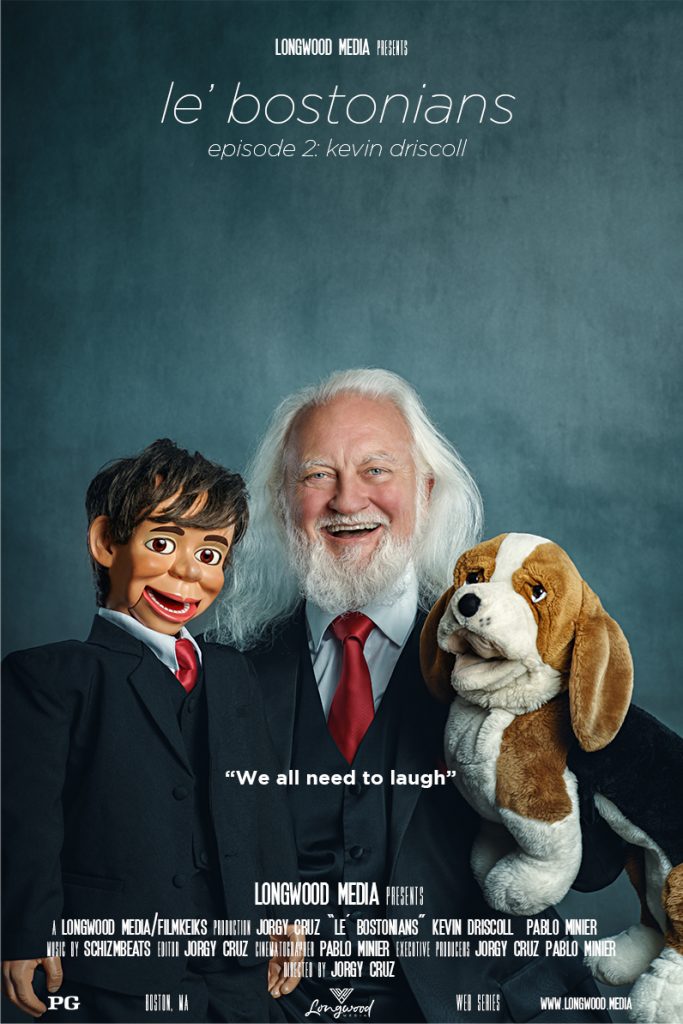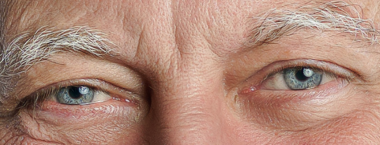
This is one of two posters that we shot for episode two of le’ bostonians, featuring the talented and always funny Kevin Driscoll together with Jerry and Doug the talking dog. I had a blast shooting with these guys, I still laugh whenever I hear Doug’s voice. For every episode, we typically just publish the posters, but for this one, I thought I’d break down how the final shot was made from start to finish.
Concept: we normally shoot the posters after we are done filming the episode, at that point, we have gained a better understanding of the subject and we can then more accurately decide what the posters would look like. For this one, we wanted to capture the sincere and uninhibited happiness that Kevin projects when he is doing his act. That is a relatively easy task since he is all smiles when interacting with Jerry and Doug.
Location: every photo shoot is different, and so are the locations. We always try to accommodate the subject, so we tend to choose locations that are readily accessible to them and that are a good fit for executing the shoot without compromising the end result. It’s easier said than done, but on this occasion, Kevin had access to a very spacious church with high ceilings that was a pleasure to work in.
Lighting: photographing a group in just one shot, without resorting to compositing the images, can be challenging when trying to control the way light will hit your subjects. For this picture, I decided to use a big modifier that would give me the softest directional light possible, like the one you would get from a large window. For my key light, I chose to bounce a 300w strobe into a 7’ Westcott umbrella with a white diffusion fabric to further soften the light. For my fill, I wanted to use an “edgier” light, so I chose to bounce another 300w strobe at the lowest power setting into a 36” silver umbrella, aimed mostly at Kevin. After some test shots, I decided not to use a hair light.

Shooting: after setting up the lights and firing a few test shots, the shooting part was a breeze. Kevin is such a pleasure to interact with, we were joking and laughing the whole time, so achieving the “uninhibited happiness” look was fairly easy. I don’t like to shoot unnecessary frames once I feel I’ve got my shot, so this is one of about 10-12 frames that we captured that day. For my fellow gear enthusiast, I shot with a Sony A7Rii and a Canon FD 200mm 2.8 prime lens.
Post-production: we had a very clear idea of the look we were going for, so post-production was very straightforward. We wanted a bit of a vintage feel to the image without overdoing it, so I color graded this image trying to mimic old film stock and shot with a vintage lens. The “wall” behind them is actually gray seamless paper that I added different textures and color in PS using the “soft light” blend mode. After some contrast adjustment, the image was good to go.
That’s it folks, a much longer read than usual but I’m always happy to talk about the process of bringing our ideas into existence. Feel free to ask away if there’s anything else that you would like to know about this image or any other content on our website.